Tuesday, December 23, 2008

ISO Settings


In the Northern Hemisphere, at this time of year, it is difficult to get enough light to see by - let alone take photos. In the time of cameras that used film it was necessary to either light your subject or change to a faster film. If you went the fast film route you may have noticed that your images were very grainy making them slightly less appealing than the pictures taken with enough light to use a slower speed film.
A simliar problem exists with digital technology. I will admit that film emulsions have improved over the years and are now much less "noisy" speed for speed than say 10 -15 years ago. This also applies to the digital format as new and improved methods of manufacture appear.
So why the increase in noise with speed? Simply, in order to attain higher sensitivity, you have to have a larger light collector. With film this is simply larger light-sensitive crystals and with digital images this achieved by grouping adjacent image-forming sensors together. In both cases this has the effect of amplifying the light received at the image plane - thus increasing the effective speed. You can see then that this means a marked reduction in resolution and an increase in noise.
This picture was taken recently and illustrates the grainy character of higher ISO settings. The effect is more noticable in the darker tones. (Notice also that there are no maximum blacks and very little shadow detail.)
This picture was taken with a Sony Erricsson Mobile Phone and I had no control over the chosen speed setting. This is the price you pay for taking the control away from the user. If I had a say in the matter I would have opted for a longer exposure time at a less sensitive setting. This phone, however, doesnt even tell you what the settings are, but, from experience, I can tell that the equivalent ISO setting would be around 800. If you look at the settings that can be adjusted on your camera you will see what the range is. The best - low noise - setting is always the lowest numerical value. Usually 100 iso sometimes less sometimes more but the lowest is the best. The latest Canon 5d mk2 boasts a low setting of 50 iso. In film terms this is the equivalent of Kodak's Kodachrome film (which was always regarded as the ulimate in image quality). If getting any image is the more important then the answer is to set your ISO seting to "auto" and let the camera work it out for you. I prefer to be in control (except when I am stuck with using my Mobile Phone). The reasons for choosing any setting will be governed by what the scene is that is being photographed. If you want fast shutter speeds - to stop movement - a fast (higher) iso number must be used but my advice is always to use the lowest practicable number for your iso setting to give smoother tones and less "grain" (noise).

Sunday, May 25, 2008

I haven't had any spare time...

Excuses, excuses. I have been trying to find time to say some more about black and white. I have been turned on by colour photography from a very early age - it must have started with "The Wizard of Oz", you know that bit where it changes from black and white to colour. Well I am prejudiced I suppose. But, once you have selected black and white on your camera settings, thats it - a lost opportunity. Now then why not have the best of both worlds. You see, if you shoot with the black and white setting it converts the colour channels to the same grey scale. This prevents you making any changes to the relationship between colour tones. If, on the other hand, you shoot in colour you can make these changes mimicing the effect you would get if you had shot the subject using colour filters. For example, a portrait of a male subject might benefit from use of a blue filter to make his skin tone rugged and weather beaten. Or a portait of a female subject might benefit from a red filter to neutralise skin tones making them softer. A landscape with a blue sky would benefit from a yellow filter to make the sky contrasty etc, etc. All these things can be done to an colour image - after the event, whereas in the days of film you had to use a filter at the time of shooting. I have done a compilation image of a pastoral scene that shows some of the possibilities.


I have labeled these images to show how they were done. The two on the right show desaturated and the other is the Photoshop CS3 Black and White setting. The black and white image on the left is how a green filter would look. Both Photoshop and Lightroom give you endless variations of filter changes and even the older versions of Photoshop can be used to provide an infinite choice by changing the colour relationships with "Levels" before desaturating the image. This is not the only way but with Photoshop one method of doing some change is as good as another (most of the time).
I will try and update more frequently now I have found a subject for my black or white blog.

Tuesday, April 29, 2008

You might not want to see this - its uncovered

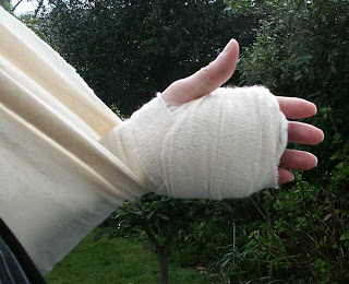
Today I had my stitches out so my digital hand looks a mess. The surgeon warned me that it would look as if a dog had savaged it and it does. I will put the image of it up as small as it will go and it's up to you if you click on it to see it life size. As a matter of interest I used the flash on the camera as available light made it look even worse than it is. After the surgeon had told me it looked ok to him i was taken away to have the stitches removed. The nurse who removed them thought I would be having physiotherapy so left it uncovered. When I checked in to physio they gave me an appointment for tomorrow. I had to come home with it as you see it. Not a pretty sight.

Friday, April 25, 2008

More about the cutting out post


I did not explain what the head thing was about. I was commissioned to do this picture -actually a series of pictures- for a record cover. In the event it wasnt used as it was considered to be too peculiar. I think the group was the Pogues but if my client ever reads this he might put me right.
I have had a number of near misses in my career so I dont mind. I did get paid for it. The image on the right has a GMW Turner picture projected on it. This technique is quite easy to if you have all the necessary equipment - that is. This one was done on old fashioned film the images having been copied from books onto transparency film and projected using a standard 35mm projector. If you are forced to use a video projector then dont forget to use long exposure times to avoid any scan lines.

Thursday, April 24, 2008

Cutting-out


Todays episode was going to be a simple cut-out. I started with a simple shape from an old portfolio picture of mine. A change in background would work well.
I opened the picture in Adobe Photoshop and tried various ways of selecting either the background or the head but neither worked. Of course I could have gone right tound it with the lasso tool - but I find when you get to a corner the lasso generally lassoos itself through a bit you didnt want to go through. The other alternative is the pen tool to make a path that can be converted to a selection. Well- you folk out there don't learn from doing it the easy way so here is how I finally got to cut it out. The first problem I had was that the image was grainy and the edge was not very well defined. To make the edge clearer I chose to use a channel. I opened the channels folder and selected first the blue channel`nd made a copy of it. This wasn't quite right so I made a copy of the red channel - this was good enough. (Unhappily when I set photoshop up I elected to show channels in colour so this is a good reason not to as you can see straight away which channel is going to give the best contrast).
The next step is to enhance the edge of the subject (it isn't really necessary here as the edge is quite clear - but you might need to do this sometime). This takes several steps.
  1. click: Image/Adjustments/Equalise
  2. The next step is click: Filter/Other/HighPass - and choose a radius that gives the best definition

  3. Next: Image/Adjustments/Levels - to give a high contrast
  4. Next you can start erazing the background roughly, not to close and eraze it to white (ie background color white)
  5. For the next step you need to clean up to the subject - I do this at fairly high magnification to see what is happening. For the forehead I used the Lasso tool and for the nose, mouth and chin I used the Pen tool to make a path which I converted to a selection. Just click on your Delete button on your keyboard to clear a selection.
  6. When I had converted the path to a selection I addeed a layer and filled my selection with white. (When you convert a path to a selection you get the opportunity to "feather" curves which I did at 1 pixel). The next thing to do was to select the white backround I did this with the Wand tool. I realised that it was going to crop into the head so I made yet another layer and filled the background with grey (it could have any colour just that I needed to see what was going on.
  7. Finally I re-selected the layer with the mouth etc. and selecting the background inverted my selection then in the top layer with the rest of the background I erazed the area where the main background was overlapping. This was easy to do as I just rubbed out up to the selection dots. To give this result:

Monday, April 21, 2008

An addition to my panorama blog


The "Layers" panel on the right is showing a "Background copy" - I did this to give me a transparent background. If you work directly onto the original Background layer the canvas takes on the colour of the background a solid tone of black, white or whatever you choose. I prefer to be more flexible. With Background copy you can reposition it, put a border all the way round and so on. If you click on the Background in the layer box and highlight it you can add a new layer which will become the base layer. This layer can be filled with a colour ot a pattern to make a border. If you want a border dont forget to cange both the width and height measures when changing the canvas size. I prefer to work with image files at the original size (full size camera original) as retouching is more accurate. When you have finished all the steps then crop and change pixel depth at the end. If your intention is to prepare an image for the web it doesnt need to be any bigger than a normal full screen size - about 1000pixels wide. If it is going in a blog it will be displayed smaller than that anyway, only going to full size when it is clicked on.

Framed - View

Saturday, April 19, 2008

An Afterthought

My previous blog regarding Panoramas was becoming too big so I published it before I was through. I would like to emphasize that there are many ways of doing things in photoshop. It is important that you remember what works best for you. My next point is regarding subject suitability. My 3 pictures just about work together because I shot them with a panoramic view in mind. You might notice that I didn't have a tripod - I got away with that. I shouldnt have used a Polariser - you might see the join in a print but it works fine on screen. My camera is tending to vignette at it's widest angle. Wide angle lenses are notorious for being brighter in the centre of image than at the edges. This is highlighted by the special filter made for the Hassleblad SWC that is calibrated to the lens you are using. This gives perfect illumination over the entire image area. I would not suggest going that far. Photoshop can compensate for this problem if you happen to be using RAW images.

A Triptych or how to join a Panorama


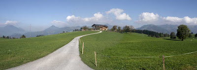
I like panoramas. Sometimes a photograph cannot contain a whole view. If I can I set my camera on it's tripod and take a series of shots -mostly landscapes-and stitch them together in photoshop. There are many programs available that do this but I get nore satisfaction out of doing it myself. Today I have chosen 3 images taken in Austria last year. For a start I will put them next to each other then marry them together.


  1. My 3 Images laid in rough position


  2. I have chosen the left-hand image to be the container for the others. Click on image choose canvas, click on a square on the left side of the box with all the arrows and then input a size you want the width to be. I chose 300cm approx 3 times the size of the background image.

  3. Choosing the centre image Ctrl+A selects the whole image, Ctrl+C copies the selection then if you click in the area of the background picture with the large empty space and then click Ctrl+V - you will have pasted the 2nd (middle) image into the picture. Do the same with the 3 rd shot to end up with 3 images together. At this stage the images can end up anywhere in the scene so.


  4. Using the Vectot tool click on the middle images layer and move it to where you want and the same with the other image. You can use this technique with as few or as many images as you can fit into your computers memory. I have ended up with file sizes of over 100Mb-things can slow down an awful lot if you go for the full 360 degrees.

  5. This illustrates the Vector or Moving tool. A very useful device. If you right click on the area you want to move a menu pops up showing the layers so you just click on the layer you want then move into potition. If all you want is to have your pictures next each other you can stop there, or, if you want to go for the panorama then move the layer into its appximate postion.

  6. Ready to crop for a Triptych.

  7. The 3 subjects I have chosen for this exercise are not the easiest as the sky is darker towards the right. This was due to my using a Polarising filter.


  8. The top image (ie the middle one) has it's left side erazed with a soft brush erazor.
    You will also notice that I have needed to put in some adjustment layers to make blending easier. I used Levels in the adjustment layers as the sky was giving me problems.

    Like this.
  9. And Finally (I straightened it up a bit)

Friday, April 18, 2008

A bit more of my portfolio


I dont have thousands of images in my portfolio as you will see - as time goes on. I had to leave piles of stuff behind when the landlord of the building I was using changed the locks. This is my first record sleeve that had my name credited on it. The group are mostly famous for "Two pints of Lager and a Packet of Crisps Please". I am sure you all remember that. Cover Design by Barbara/Ian for Cream (I don't think they still operate under that name). The shoot was'nt altogether a success as Splodge (the dog) wouldn't pee into the horn. Et was all we could do to get him to stay in shot. This was long before Photoshop got going. I am not saying it wasn't around just my clients were artists and didnt hold with new-fangled technology. (Sorry Ian). The wonder was that we got anything at all. Such was the life of a Photographer in those days. As I said before - this was the first of my oics to carry my name. There are many occasions when the photographer is anonymous -some planned and some not.

My first actual album cover doesnt really count as it is only a flat-art copy. This, however, was much more tricky than the Splodge as it had to be dead straight - there being no Photoshop etc. My first was Pink Floyds "The Wall". The artwork was a full size (almost) rendition of a cartoon drawing of a wall. Of course my copy of the album doesnt quite make it straight. To get the shot we had to borrow a large studio and 10x8 camera -the lot. My little company didn't run to such luxuries. We had tried shooting outdoors but I got colour casts from the doors of the lock-up garages in the mews I worked in. Also the traffic wardens weren't very helpful as also the weather. I think the only tip I picked up from this exercise was how to make sure the camera was flat on to the artwork. If anybody needs to know this kindly drop me a line or put a comment up.

Sunday, April 13, 2008

My hand

This is the current state of my left hand which will be under wraps for the next couple of weeks. I have been given 2 weeks supply of painkillers and am slightly concerned that I dont really need them. As you can see the NHS do a fine job of bandageing - they hd a bit of trouble with the sling though. They are not allowed to use safety pins so it looked a bit of a mess until I got home where we are not governed by health and safety issues. I think that I am going to start a political party whose manifesto is to disband the H&S Executive so we can all be treated as sensible human beings. The human race is known (in latin) as homo sapiens sapiens - this means wise, wise man - I don't think so.
I don't think this blog has much to do with photography, but, as I may have said before everything I write in this blog is my own opinion and is derived from years of experience.
You may like to know why my hand is bandaged up. Well it has been operated on for a condition called Dupuytrans Contractor. My fingers were curling in towards the palm as the tendons had developed a growth surrounding them. The nice people at Charing Cross H{ospital seem to have done an excellent job and my thanks go out to the team on the 7th floor that looked after me for the day. The consultant was Mr Forester and if you ever need it done I would recommend him. The dupuytrans.co.uk web-site like to make it clear to everybody that you must choose your surgeon with care as not all surgeons are up to the delicate surgery involved in working on the hand - which has more bones, tendons, nerves and blood vessels than practically any other part of the body.

Saturday, April 12, 2008

Close-up

Today's topic is the close-up, as in macro-photography. I am not going to illustrate this as it is rather technical and I want to simplify it for you. Let us say that we want photograph a small insect. If you were using a slr 35mm film camera you might want to fill as much of the image area as possible or at the very least shoot it the same size as in real life. The standard lens for a 35mm has a focal-length of 50mm (this corresponds to the diagonal measurement of the film plane). To obtain an image of 1:1 ratio ie same size you will need to use extension tubes that will add another 50mm to the distance between the effective centre of the lens and the image plane. If you achieve this you would find that point of sharpest focus is about 100mm away. The point of sharpest focus at the widest aperture is very shallow about 1 or 2 mm. To get sharp focus therefore you need to be able to rack the camera in and out with quite a lot of accuracy. It is extremely unlikely that you could use autofocus effectively as there is no point in moving the focussing ring on the camera as all it will do is make your slightly out of focus image smaller or larger as by try to focus using the cameras focus moves the lens further or nearer the image plane.
Now then, if you are trying to do this with a zoom lens you might find it difficult as the construction of a zoom lens uses negative or extra elements to change the focal length. Most lenses of this type use a telephoto design to reduce overall size. The most likely outcome is that the subject ends up so close to the front of the lens that it is impossible. As an example of this the Canon 300D was made with the reflex mirror small enough to site the lens nearer the image plane - but still it is what is called retrofocus (ie the focussing distance is greater than the effective focal length). To achieve optimum close up focussing the focal length of a lens needs to be greater than the physical body depth plus the distance to the effective centre of the lens array. Even if you can achieve real close up with a zoom or retrofocus lens the field of sharp focus will not be flat. Lens manufacurers go to a lot of trouble to make "macro" lenses. However, they are worth it as an investment. As a general rule I prefer single focal length lenses over zoom lenses as I have found them to both sharper and clearer than zoom lenses. If you are thinking of buying new lenses always read the reviews and not just from one source. Never trust a salesman to give unbiased advice. There is a lot more to be said on this subject. I will try to illustrate it next time. Any questions - please ask.

Monday, March 31, 2008

Image Size

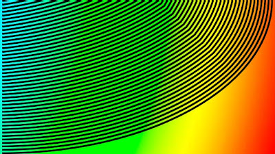
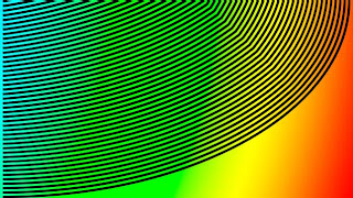
I made this image to show you the effect of random reduction or enlargement of images when used on the web. I am sure you have all see the effect. The top image is how I made it and the next two are:
  1. Reduced by a third ie 66.6% of the top image
    You can see the lines have developed saw-tooth edges.


  2. Reduced by a half or 50% of the top image
    You can see that the lines have retained their smooth edges.


Now, I hope, you can see that if an image is reduced by a third - strange things happen to edges. When it is reduced by an even number the effect is not so marked. The reason is that digital images are made up of pixels. A pixel is the smallest block of the screen image. It is indivisible - so you can,t have thirds or even halves of a pixel. What you can do is take a square block of 4 pixels and reduce it to 1 - this halves the image size. This image, on the left is the same as the one at the top but reduced, by blogspots software, to emphasize the point I am making. If you click on the image you will see that it is back to normal. When you are making images for a web page or a Blog try and reduce the image before hand to exactly the right size to fit the parameters laid down by the Host. But it is, I think, wise to work with reductions or enlargements that are even number divisions or multiples of the original. Photoshop, for example, will do quite a good job at resizeing images but at some magnifications and with some subjects there is a danger of producing dramatic moire pattern effects.

Colour or is it color?


You may think that a grayscale (above) is not about colour - well you are wrong the picture at the top of the screen will tell you many things about the way your computer is set up and how accurately it records colour. The step at the left end of the scale should be pure white and the right end pure black. All the intermediate tones are pure tones of grey. That is they all have equal quantities of red, green and blue. If you see any colour other than grey in this greyscale it will be because your monitor/video card need adjustment. Similarly, you should also be able to see 21 steps in the greyscale so adjust your brightness/contrast controls until you can.
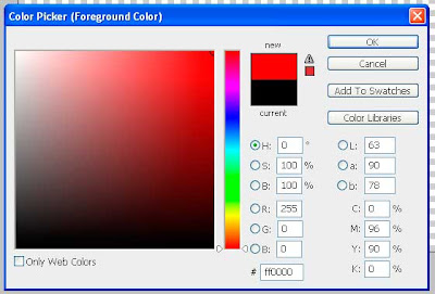
If you have Adobe Photoshop or Elements why not download this greyscale and check this for yourself. If you now have the greyscale image on screen click on the "Foreground" colour near the bottom of the Tools bar and get the color picker screen up. Using the eye-dropper move it over each grey tone and note the values. The image below illustrates what it looks like for red. When you put the eye-dropper on any tone in the image the colours of that tone are shown in the color-picker. Look at the R,G,B figures to see what the values are.
This screenshot shows the values of pure red (just to confuse you). The values are recorded as R-255, G-0 and B-0 in the above illustration. Where 255 is full red and the others none. In web design we can use either these values or (I prefer) the hexadecimal value which in the above illustration is #ff0000. Taking my example. If you want pure white you can click on the G and type 255 and B and type 255 with all the values at 255 you will have pure white. If you shoot a picture that you want a tone to be pure white Make sure that your foreground colour is set to pure white by checking its values. Then using "Levels" or Adjustment Levels" use the highlight eyedropper and place it in the area you want white and it will be white.


Saturday, March 29, 2008

More Unsharp Masking


The image on the left is an actual illustration of unsharp masking at a magnification you might need to use. The area to the right of the dots has unsharp masking applied. You might notice the black dots scattered around - these are known as artifacts (in the trade). You might not want see your pictures liberally laced with black spots. I admit you will need to be making a very large print but even at small magnifications these spots will appear. The image on the left is not much of an exageration - so be vey careful.

Unsharp Masking

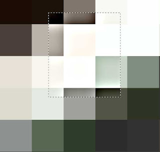
Some cameras allow you to turn a control called "Unsharp Mask" on and off. I prefer to leave it off. This picture tells you why I think that. I admit I have exagerated the effect (quite a lot) but if you look at the magnified pixels inside the dotted box you will notice that instead of being all one tone the edges are darker against a light edge and lighter against a dark edge. Of course its not as bad as this representation - but....
If you leave it off you can put it on later with most image editing programs. You will need to add it if your photography is not as pin-sharp as you would like or if you want to make the detail a bit crisper. I would recommend that you keep a copy of the original without it though as the results of overdoing masking can be particularly nasty in photographs that are printed out as all the pixels in the image have an edge to them - even where you dont want it. If you do need to sharpen your image, despite my warnings, I would recommend using the unsharp mask option as being the best and most effective. In Photoshop you have a large degree of control. Incidentally my illustration is made by screen grabbing three times to make the pixels that large.

Friday, March 28, 2008

A lighting technique

In the previous blog you may have noticed that my subject was a - highly reflective- chrome object. When photographing shiney objects it sometimes looks better if you light the subject so that it only reflects white (instead of other incidental surroundings). To aid this I made a white "tent" out of an old - white - plastic bag and attached it to the lens with a rubber band.
This picture illustrates the tent arrangement and this one
is a suitable subject. If you have larger objects to photograph it may be necessary to build a tent from suitable material. In the past I have used "Kodatrace" - a drawing office type of material, translucent plasic - similar to the plastic bag and also polystyrene sheets and using a "soft-box" as a light source. Naturally the lens will be reflected in the subject so this an occasion to use a long focal lenght lens to get the camera as far away as possible so that the lens reflections is small. Then it is quite easy to remove using an image editor - such as Adobe Photoshop. I intend to clean the shot up later - as you can see there are still a lot of reflections going on.

More on Depth of Field

To emphasize the effect of the f number on the depth of field I have produced a photo of my bit of plumbing (in situ). The waste connector is in a wooden sink and I have shot it at an angle to show what the depth of field is at f3.5 and then at f9.5.
You need to click on the image to open it up to full size and then you will see the difference a couple of f-stops can make.

Lightroom continued


I have only a short time to finish this review before it's time is up. You will find loads of tips and stuff about image editing programs on the internet. I am not setting myself up as a "guru" but I can give you the benefit of my experience. Computer programmers and software developers dont often see the problems confronting the end user. There are changes I would make to some of these programs -if asked. Likewise there are changes to the hardware that would make everyones life easier - but life aint like that. Lightroom seems to be very well thought out and is an ideal tool for the busy pro-photographer. It gives a degree of control over all aspects of the image that are simply amazing. There are some things that need the power of the parent Photoshop, but, for colour correction and general image correction I dont think you could do much better. This image of the control panel for image "Development" shows just the basic settings that can control the colour and tone of the image.

Don't forget that all these images can be seen at full size by clicking on them to open them in a new screen.

The panel on the left shows the left side of the screen just to show the complete picture. This is the Navigator panel and shows some of the other panels and modes that there are. I am really impressed by the cropping tool which, if you choose, can provide a grid based on the mythic Golden Rule (as I mentioned in my composition blog). A word about saving your work. Lightroom saves your work in a special catalogue file - it doesnt re-save your jpegs causing compression problems. Lightroom does, however, ask you to back your catalogue files up. This is very important. Once you have done all your corrections and saved them, made prints,etc, You can do further editing of your images by exporting them to an external image editor (such as Photoshop) you can do this by sending a copy of your image with or without your edits. I could list all the possibilitied that Lightroom is capable of but perhaps you should find out for yourself. I recommend downloading a trial copy.