Monday, March 31, 2008

Image Size

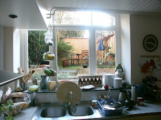
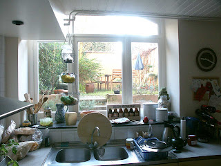
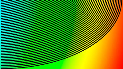
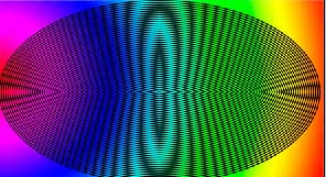
I made this image to show you the effect of random reduction or enlargement of images when used on the web. I am sure you have all see the effect. The top image is how I made it and the next two are:
  1. Reduced by a third ie 66.6% of the top image
    You can see the lines have developed saw-tooth edges.


  2. Reduced by a half or 50% of the top image
    You can see that the lines have retained their smooth edges.
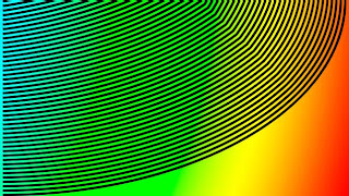

Now, I hope, you can see that if an image is reduced by a third - strange things happen to edges. When it is reduced by an even number the effect is not so marked. The reason is that digital images are made up of pixels. A pixel is the smallest block of the screen image. It is indivisible - so you can,t have thirds or even halves of a pixel. What you can do is take a square block of 4 pixels and reduce it to 1 - this halves the image size. This image, on the left is the same as the one at the top but reduced, by blogspots software, to emphasize the point I am making. If you click on the image you will see that it is back to normal. When you are making images for a web page or a Blog try and reduce the image before hand to exactly the right size to fit the parameters laid down by the Host. But it is, I think, wise to work with reductions or enlargements that are even number divisions or multiples of the original. Photoshop, for example, will do quite a good job at resizeing images but at some magnifications and with some subjects there is a danger of producing dramatic moire pattern effects.
Colour or is it color?


You may think that a grayscale (above) is not about colour - well you are wrong the picture at the top of the screen will tell you many things about the way your computer is set up and how accurately it records colour. The step at the left end of the scale should be pure white and the right end pure black. All the intermediate tones are pure tones of grey. That is they all have equal quantities of red, green and blue. If you see any colour other than grey in this greyscale it will be because your monitor/video card need adjustment. Similarly, you should also be able to see 21 steps in the greyscale so adjust your brightness/contrast controls until you can.
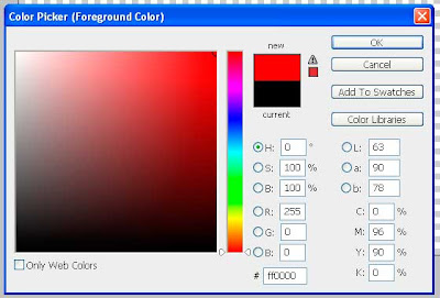
If you have Adobe Photoshop or Elements why not download this greyscale and check this for yourself. If you now have the greyscale image on screen click on the "Foreground" colour near the bottom of the Tools bar and get the color picker screen up. Using the eye-dropper move it over each grey tone and note the values. The image below illustrates what it looks like for red. When you put the eye-dropper on any tone in the image the colours of that tone are shown in the color-picker. Look at the R,G,B figures to see what the values are.
This screenshot shows the values of pure red (just to confuse you). The values are recorded as R-255, G-0 and B-0 in the above illustration. Where 255 is full red and the others none. In web design we can use either these values or (I prefer) the hexadecimal value which in the above illustration is #ff0000. Taking my example. If you want pure white you can click on the G and type 255 and B and type 255 with all the values at 255 you will have pure white. If you shoot a picture that you want a tone to be pure white Make sure that your foreground colour is set to pure white by checking its values. Then using "Levels" or Adjustment Levels" use the highlight eyedropper and place it in the area you want white and it will be white.


Saturday, March 29, 2008

More Unsharp Masking


The image on the left is an actual illustration of unsharp masking at a magnification you might need to use. The area to the right of the dots has unsharp masking applied. You might notice the black dots scattered around - these are known as artifacts (in the trade). You might not want see your pictures liberally laced with black spots. I admit you will need to be making a very large print but even at small magnifications these spots will appear. The image on the left is not much of an exageration - so be vey careful.

Unsharp Masking

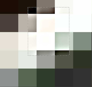
Some cameras allow you to turn a control called "Unsharp Mask" on and off. I prefer to leave it off. This picture tells you why I think that. I admit I have exagerated the effect (quite a lot) but if you look at the magnified pixels inside the dotted box you will notice that instead of being all one tone the edges are darker against a light edge and lighter against a dark edge. Of course its not as bad as this representation - but....
If you leave it off you can put it on later with most image editing programs. You will need to add it if your photography is not as pin-sharp as you would like or if you want to make the detail a bit crisper. I would recommend that you keep a copy of the original without it though as the results of overdoing masking can be particularly nasty in photographs that are printed out as all the pixels in the image have an edge to them - even where you dont want it. If you do need to sharpen your image, despite my warnings, I would recommend using the unsharp mask option as being the best and most effective. In Photoshop you have a large degree of control. Incidentally my illustration is made by screen grabbing three times to make the pixels that large.

Friday, March 28, 2008

A lighting technique

In the previous blog you may have noticed that my subject was a - highly reflective- chrome object. When photographing shiney objects it sometimes looks better if you light the subject so that it only reflects white (instead of other incidental surroundings). To aid this I made a white "tent" out of an old - white - plastic bag and attached it to the lens with a rubber band.
This picture illustrates the tent arrangement and this one
is a suitable subject. If you have larger objects to photograph it may be necessary to build a tent from suitable material. In the past I have used "Kodatrace" - a drawing office type of material, translucent plasic - similar to the plastic bag and also polystyrene sheets and using a "soft-box" as a light source. Naturally the lens will be reflected in the subject so this an occasion to use a long focal lenght lens to get the camera as far away as possible so that the lens reflections is small. Then it is quite easy to remove using an image editor - such as Adobe Photoshop. I intend to clean the shot up later - as you can see there are still a lot of reflections going on.

More on Depth of Field

To emphasize the effect of the f number on the depth of field I have produced a photo of my bit of plumbing (in situ). The waste connector is in a wooden sink and I have shot it at an angle to show what the depth of field is at f3.5 and then at f9.5.
You need to click on the image to open it up to full size and then you will see the difference a couple of f-stops can make.

Lightroom continued


I have only a short time to finish this review before it's time is up. You will find loads of tips and stuff about image editing programs on the internet. I am not setting myself up as a "guru" but I can give you the benefit of my experience. Computer programmers and software developers dont often see the problems confronting the end user. There are changes I would make to some of these programs -if asked. Likewise there are changes to the hardware that would make everyones life easier - but life aint like that. Lightroom seems to be very well thought out and is an ideal tool for the busy pro-photographer. It gives a degree of control over all aspects of the image that are simply amazing. There are some things that need the power of the parent Photoshop, but, for colour correction and general image correction I dont think you could do much better. This image of the control panel for image "Development" shows just the basic settings that can control the colour and tone of the image.

Don't forget that all these images can be seen at full size by clicking on them to open them in a new screen.

The panel on the left shows the left side of the screen just to show the complete picture. This is the Navigator panel and shows some of the other panels and modes that there are. I am really impressed by the cropping tool which, if you choose, can provide a grid based on the mythic Golden Rule (as I mentioned in my composition blog). A word about saving your work. Lightroom saves your work in a special catalogue file - it doesnt re-save your jpegs causing compression problems. Lightroom does, however, ask you to back your catalogue files up. This is very important. Once you have done all your corrections and saved them, made prints,etc, You can do further editing of your images by exporting them to an external image editor (such as Photoshop) you can do this by sending a copy of your image with or without your edits. I could list all the possibilitied that Lightroom is capable of but perhaps you should find out for yourself. I recommend downloading a trial copy.

More Adobe Lightroom


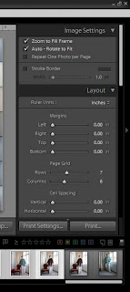
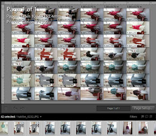
After I blogged my last blog a friend asked if you could do comtact sheets in Lightroom. Well so you can as these screen grabs will testify. This image shows the control panel which shows that I have set the page out into rows and columns.

This image, of the preview area, shows the thumbnails along the bottom - which are oriented upright - whilst the preview panel is in the landscape view principally because the default setting on my Canon Pixma ip4300 is set as landscape (as I was previously printing landscapes).

Thursday, March 27, 2008

Printing with Adobe Lightroom

Before my trial version of Adobe Lightroom ran out I decided to try printing a batch of pictures - about a 100 or so. I was very impressed. My photos were all taken with the same light and so after I had done one to check it was ok I just went through the whole session choosing the image to print from a thumbnail and so was able to set up quite a large batch to print at a time.
Habibe Designs

Friday, March 21, 2008

Where did I leave off

Oh yes! On yesterdays blog I forgot to mention that the Minolta Dimage 7i, that I use, has a Macro button on the lens. This means I was able to get to .30 of a metre with the wide angle setting and in the picture I am putting up today - the Long focal length Macro setting allows you to get to .25 metres. The difference is dramatic. (Those of you who do not have this facility should purchase either/or a close up lens or extension tubes) The wide angle shot was trimmed out of the full frame where the long focal length shot was almost full frame (I just cropped it a bit to make it stand up straight). I have placed a blue line across todays image to show where the point of focus is. This picture is shot at f3.5 (almost the widest aperture). The depth of field is very small and it is difficult to decide where to focus. The most important thing to remember about close up work is to set the lens to focus at a point where you have as much of the subject as you want in frame. Then to focus critically you either move the camera or the subject. At extreme close up ie. 1:1 there is no other way of focussing. USM etc will not help. Of course you might by a flook prove me wrong - but I write from the knowledge of 50 years experience.

Finally. A word about the images I am using. If they are shot with my digital camera I cut the image size down to 960x1280 pixels and then saving them at 30% quality in jpeg. I dissobey my own rule of not saving the image as a photoshop image first simply to get maximum image size reduction. The images on Blogspot are kept in Picasas web storage facility and I dont want to use all my available storage space let alone using precious bandwidth.

Thursday, March 20, 2008

Depth of Field and Telephoto -Zoom

The depth of field in a picture is the two points, in front and behind, of a subject that appear in sharpest focus. These distances are governed by four things in the main
Firstly - the actual focal length of the lens. Second - the distance the subject is from the camera thirdly - the aperture that is set on the lens and finally the size at which the image is to be viewed. These are not in order of importance they all effect the result. The two images I am going to use for this do two things they show the difference between wide angle close up and long focus.

The left image is taken with the lens on maximum zoom and the right image is shot at maximum wide angle. They both had the same aperture (fully open for the zoomed shot and stopped down a tad for the wide angle shot).
As you can see the longer the focal length the less the depth of field is - there is more apparently sharp in the wide angle. Shot - but if you click on it to make it larger - there is less apparent sharpness. This is the result seeing the image small it looks sharper than if you enlarge it. If I had used a smaller aperture ie stopped down to the cameras smallest aperture of F8.0 then the sharpness would be increased quite a large amount in both cases.
The only thing remaining is the 'apparent' focal length. My camera says that the wide angle setting is eqquivalent to 28mm on a standard 35mm camera but, it is in fact only 7.4mm. This shorter focal length will produce substantially sharper looking images than an actual 28 mm lens at the same aperture. The reason is the same as for the difference in the above two pictures. Let me know if you still have a problem with that.

Monday, March 17, 2008

Small Studio sets


Sometimes you need to get over the top and look straight down on the subject. In the example pictures above you can see how I have arranged my tripod. The two front legs being vertical with the back leg extended a bit more to make this happen. Naturally mother nature doesnt allow this as we get a centre of gravity problem. To overcome this I have tied a doorstop to the back leg. Any heavy object that is tie-able will do. The lighting was provided by daylight through the window. To light the shadow side of the subject I have simply bounced the light back with some sheets of paper. If you do this sort of thing a lot I suggest obtaining a sheet of white polystyrene from a builders merchant. You may be lucky and find some small enough to get in the car. If you need to cut the polystyrene the cut edge might need taping up with what I know as "gaffer tape".


Just to prove it works I exchanged my trusty old 'Los Angeles Olympics 1984' Canon F1 for the Minolta Dimage 7i and took a snap This is how it looked straight from the camera. To improve things a bit I used a technique described on the Photoshop Heros site. The trick I used was the "Velvia" one where the colours in the picture are intensified to make it look like the effect you got with Fuji Velvia in the days of film (it is still available).


Lightroom

In one of my previous missives I said that Lightroom did not have a very comprehensive printer control. Well obviously I am blind, slightly anyway, the printer controls appear - like all other menus - when you run your mouse over the menu button. My reservation with this is that if you use the print options in the "File" menu these alternatives are not shown.

Sunday, March 16, 2008

Composition

Today I am going to try and cover composition. The first thing to say is that every person is entitled to see things their own way and that all rules (in life and composition) should be treated with an element of suspicion. Beauty is in the eye of the beholder so they say. As an example I am using a simple Austrian landscape. First as shot:-

As you can see - a typical mountain scene with a road leading to a house. It's no prize winner but I think it's OK. With the aid of hindsite I might have cropped it so that the farm house obeyed the Golden Mean or Section rule I suggest that a Google search on this subject would be better than me explaining the concept. But with an image editor (Elements or Photoshop) such a thing is possible.

This is going some way towards my aim - which is to have the road lead the eye to the farm house - but it needed to have slightly more foreground (I cut a chunk off and placed it at the bottom to give more depth). Doing this moved the farmhouse further up the picture so that it was close to the intersection of the image divided into thirds which approximately corresponds to the Golden Mean (Section or Ratio)

This is the way composition works - the eye needs to be drawn to the subject or object of interest. Any way of doing this has the same effect but the Golden Ratio system is meant to be aesthetically pleasing. If you are taking a picture for advertising purposes then anything that draws the viewers eye to where it matters is mostly what it's about. You could use lighting to the same effect.

Saturday, March 15, 2008

Evening and Night Photography


This picture was taken as the sun was setting, when the sun has just gone below the rim of the earth. The street lights are on and the shops are lit-up. If you were to set the colour temperature setting on your camera to "Tungsten" the sky will go to a more interesting colour. The bottom picture is shot with a daylight setting and the top has been adjusted to look as it might shot with a tungsten setting.

This is just one approach to shooting at night. Another is to use flash to capture moving objects but also using a camera shuuter speed that will allow the ambient light to record. I don't recommend that you photograph passing vehicles in case you cause distress to the driver. At least not without warning them first. When shooting in this way it is best (if you can) to use something called second blade synchronisation. What happens here is the camera flash will fire at the end of an exposure instead of the beginning (as normally happens). For example: you could photograph someone running (dancing or any movement) and what happens with the image is that the last bit of the movement is recorded with flash and is static with the blur behind it. Try shootting both ways to see what I mean. I will try and produce some images to back me up on this. One more thing is to remember that the best light of the day occurs a couple of hours before sunset - when the shadows are long and the colour is warm.

Friday, March 14, 2008

This is how it looks with the outside at the original density. It isnt perfect as I only spent 5 minutes doing it - but you get the idea. This image was made using two layers the top layer being thae lightened version and the bottom being the original. I just used the "Lasso Tool" to select the glass bit of the window and deleted it from the lighter version. Easy when you know how. As there are several different ways you can do the same thing - why not try doing it differently.

Photoshop Levels


By special request I am covering levels in Photoshop today. Open a picture in Photoshop and you might find something like this image where the meter was reading what the light was doing outside. If you now click on "Image" on the top menu bar the "Adjustments" then levels you will see agraphic display of the highlight, midtone and shadow regions of the picture. Under the graph it will say 0(shadow) -1.0(mid-tone) - 250(highlight). Above each figure there is a slider. By dragging the midtone slider to the left (for example) the midtones are lightened - lowering the contrast of the picture. The slider on the right, when moved to the left, will lighten the image. In the following example I have done just that. In the lighter image the sliders now read o, 1.7, 180.


If you want to be really smart you could find a way to keep the image outside from becoming too bright and still retain the interior density. I will away now and do just that - for next time. As mentioned in a previous episode if you make a duplicate layer and do your levels adjustment on that you will find photoshop, rather cleverly, retains your changes in the levels panel, but only if you do the levels adjustment as an adjustment layer, "Layers", "New Adjustment Layer", "Levels" and tick the box that is next to the statement that says "Use Previous Layer to Create a Clipping Mask".
See the following blog

Thursday, March 13, 2008

Printing photographs

If you have a printer that prints pictures at a good quality - and you cant wait to take your images to be printed at a photolab - make sure that you are using the best available settings on the printer. If you are printing from Adobe Photoshop or Elements it is better, in many cases, to let photoshop handle the "colour management". This means that you need to disable the printers own colour management preferences and make sure that Photoshop or Elements is set to use the programs colour management. I am using a Canon iP 4300 and have found that this produces the nearest print colour to the screen. The printer controls on both these Adobe products are excellent when used this way. In my experience, allowing the program to tell the printer what to do, seems to give the best results in whatever Image Editing system you use. While I am on the subject of printing I have found that printing from Adobe Lightroom doesnt give so many possibilities as Elements and Photoshop itself. The main thing it lacks is the control over how the image is enlarged or reduced to fit a print size. I have been printing 6inch x 4inch prints from digital images taken on my Minolta Dimage 7i. As the format does not fit the print size I have been adjusting the magnification, slightly, to fill the print area - you can't do this in Lightroom. This surprises me as the print engine must already exist for the other programs so why not use it on Lightroom? Maybe someone will let us all know. It is a waste of time and money if you have to keep swapping from one program to another merely to output your work.
You can regard the previous passage as part of my ongoing assessment of the Adobe products.

Title Picture

You may have noticed my new banner title. This is another advantage of using Adobe Photoshop. The type tool is very versatile and allows styles to be applied - such as drop-shadow, embossing, contouring and many others. Loads of control as well. I have played for hours getting the ultimate text design - mainly for web pages. Of course it is not necesarily a good idea to use images instead of text in a web page as our friends at google have one less thing to search on. Sometimes you have to do what is most pleasing to the eye.

Tuesday, March 11, 2008

Another Portfolio Pic


A Bit of My Portfolio
This is an old shot of mine. The band "Drop Nineteens" were a bit taken aback when they were shown it - the were an American band who weren't at all associated with the image. The art director "sold it" as it was different -to say the least. The shot was taken in a teaching hospital in London, (they were very helpful), we were shown into a big room with stainless steal benches dotted around. Some of the benches had body shaped objects on with covers over them. To cut a long story even longer we found a Technician and told him that we had arranged to photograph a human brain - and he said @right then - how do you want it'. We thought in a jar. So he slapped it in this glass jar and filled it with water and what you see here is the result. This image is not - by any means - digital but shows what old fashioned film could do - and we didnt have to spend hours sweating over a hot computer to get the effect. However the drop nineteens label was added afterwards. The faces on the back cover were also done "in camera". Has anyone heard of this group?
The art direction on this shoot was by Ian Kay of Hills Archer Studios

Adobe-Photoshop, Elements and Lightroom

I thought I would try my hand at software review. I downloaded the trial versions of "Elements" and "Lightroom" to see how they compare to the "Photoshop" type. I am comparing them to the latest CS3 Photoshop as they are, in many ways, interconnected. Elements is probably called "Elements" because it has some elements of the parent Photoshop. All three of these systems perform very well in the fields inwhich they are intended to operate. Elements has some strong editing functionality using most of the tools found in Photoshop. There are obvious differences in both Elements and Lightroom. Elements is designed to handle small (ish) files. It wouldn't touch the panorama that consisted of 15 layers of large digital image files. But then, it was over 100meg. Photoshop takes long enough to load it. The file saving was paerticularly good as it offered a jpeg2000 option. If you don't know anything about jpeg2000 it is worth looking up on the web. There is too much to be said about it here. It's major benefit is that it will compress a file without loss. (you do have the opportunity to reduce file sizes further with a bit of loss but it's still better than the old jpeg standard. I reduced am image from 45,700 to 3900kb in it's lossless mode.
Photoshop CS has the jpeg2000 plugin as an option on the CD in a folder "Goodies", "Optional Plugins", "Photoshop only", "File Formats", "JPEG2000.8BI. Just copy this file and put it in the plugins folder in the Photoshop folder in the Programs directory putting it under "File Formats". You can Comment me if you need any help with this. I will continue this blog later when I will tell you about Lightroom.

Saturday, March 8, 2008

Long focal length lenses


I was hoping to use an example of the sort of problems encountered with lenses of 200mm or equivalent, it seems that I deleted it so here is a good one(well OK). To cut a long story short. I borrowed a Canon 350D camera with a Tamron zoom lens that I was using at about 150mm focal length equivalent - 38mm actual . I was using a pretty solid tripod and available light. I had spent hours the previous day trying desperately to get a sharp image. The camera was on a Manfrotto tripod - one heavy duty enough for a 4x5 camera. The lens seemed to become sharp at f16 so that is what this was taken at. To complete the job I set the camera to "Mirror-up" and used the remote control release. Well the shots came out sharp and the client was pleased - and he paid me. However, if I had not have spent a few hours experimenting then it would have been a disaster. When shooting for best quality I try and use the 100 ISO setting as that produces the least "noise" in the picture. The Canon is still pretty good at higher settings but if you want to avoid speckly shadow areas then stick with the slower ISO setting.
As a result of this I was using a shutter speed of 1/2 sec which is far too long for hand holding. In this picture of a full size dining room chair you can see how sharp it is (at least you can in the original). If you are taking pictures in extreme circumstances, without a tripod, try and find something solid to lean the camera on and also shoot several shots at a time. Usually at least one will be sharp. If you are shooting moving objects- and you need to pan the camera with the movement-keep your finger on the expose button. Digital film is cheap opportunities are rare.

Thursday, March 6, 2008

Todays Photoshop tip

A quick tip for all photoshop and Elements users:
When using layers, and I hope you are, give them a name. To name the layer is quite simple just click on the layer to get the drop-down menu and at the top click on rename layer. If you get loads of layers in a complicated edit you will find it easier to navigate. Layers can also be grouped together and color coded to make it easier still. I have worked on multi-layered images that have had about 50 layers in 10 groups of 5. When they are grouped together you can turn the whole group off and on - a great time saver when doing multiple roll-overs.

A record cover


This picture for the Irish group "The Frames" is an illustration of depth of field. Tne background to the picture was foil with the lyrics typed onto it with a typewriter that had no ribbon. I was required to make it as out of focus as possible hence the nails through the apple being the only sharp bit. Dont ask me why though - perhaps it's art.

Wide angle - telephoto


In my last blog the illustration I used was taken at mximum wide angle. Todays picture is taken with the lens set at near full zoom. The camera I am using for these shots is a Minolta Dimage 7i. This camera has a 5 megapixel ccd and is more than adequate for this demonstration although a Canon 350d or 400 would be slightly different on the depth of field examples - you have to try this for yourself. The the longer the focal length of a lens the narrower the band of sharp focus you also get a change in perspective. In the not too distant past text books on portraiture would advocate being at least 2metres (6ft approx) from your subject so it would be useful to have a lens that fills the field of view with the subject. In my illustration you will see the depth of field quite clearly when shot zoomed in on the subject. The effect of stopping down is also very noticeable. You will perhaps notice (with your own camera) that your wide angle images and zoomed images behave differently. This is because the focal length to ccd size varies considerably from camera to camera. With the Dimage 7i the true focal length of the lens is 7.3mm which is the equivalent of 28mm on a camera with a full(35mm) size ccd. (the ccd is the part of the camera that is in the 'film' plane and receives and converts the image to digital data).

Tuesday, March 4, 2008

More on photography


Depth of Field
Many people do not understand depth of field. Simply it is the region, in a picture that is acceptably sharp. What is acceptable is entirely dependant on how big an image is to be reproduced and how far away the viewer is. A picture, of a landscape - for example, that has sharp focus in the middle distance will be acceptably sharp from close-up to the far distance when printed at a small print size (6inch x 4inch) but will only be acceptably sharp at the point of focus at poster size (30inch x 40inch). This you can see for yourself by experiment using your computer printer -for instance.
Depth of field is governed by several things.
  1. Aperture: if you have control over your camera and can control the aperture size. The aperture is the iris diaphragm inside the lens system. When it is very small it is said to be stopped down (f8 say) and when it is wide open the aperture will be close to the maximum possible. Sometimes the maximum varies, with some makes and types of lens, the reason we dont need at this moment. When the lens is set wide open the depth of field, at a given focus point, will be shallower than when stopped down the smaller the aperture the more depth of field you get.
  2. Focal lenght: most cameras seem to have zoom capability. If this is through changes to the lens and not digital zoom the depth of field at wider angles of view will be greater than with narrower angles as when you zoom-in.
If you want to use selective depth of field, concentrating the attention to a small depthof the image, then you need to set the camera away from the subject and select a wide aperture ie F2.8 or f3.5. You will have the narrowest band of sharp focus at the maximum zoom and maximum aperture and corresponding greater sharpness at smaller amounts of zoom and/or aperture.
In the accompanying photograph I have photographed som rulers indicating the f stop number on each of three images. I will tell you more in my next episode.